Too many places to figure out how to order.
Pickup, local delivery, and shipping each introduced different questions, timing, and expectations.
Consumer commerce · Native iOS concept
Turning a fragmented ordering process into one clear mobile flow.
Bizzy Bakery had strong product demand, but ordering depended on several different channels and fulfillment methods. I designed a mobile experience that lets customers browse, build an order, and request pickup, local delivery, or nationwide shipping without forcing the business into an operational model it was not ready to support.
The business problem
Customers could discover the bakery through social channels, delivery platforms, direct messages, and word of mouth, but the path from craving a product to placing the right kind of order was fragmented.
Pickup, local delivery, and shipping each introduced different questions, timing, and expectations.
Availability, timing, local delivery details, and nationwide shipping costs could not always be guaranteed instantly.
The MVP needed to organize demand without promising automation the business could not reliably fulfill yet.
Product strategy
Instead of forcing Bizzy Bakery into an instant checkout model, the app treats ordering as a structured request. Customers make their choices first, then the bakery confirms the details that still require human judgment before payment.
01 · Discovery
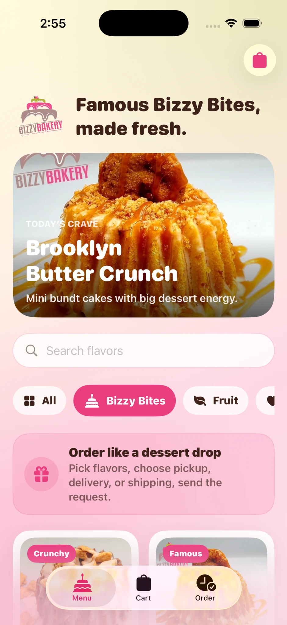
The menu experience is visual and direct. A featured product, search, category filters, and product imagery make discovery feel closer to browsing a bakery counter than navigating a utility app.
Bizzy Bakery already had a playful, high-energy identity. The interface keeps the pink, cream, and chocolate palette while giving the experience stronger hierarchy, navigation, and product structure.
02 · Product selection
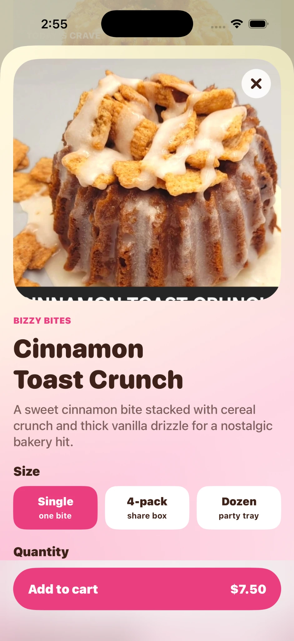
The product detail view keeps the food image dominant, then narrows the decision to the few things that matter: what it is, which size the customer wants, how many, and the price.
Large photography carries the emotional part of the purchase so copy can stay short.
Size selection is grouped into clear cards instead of a dense configuration form.
The add-to-cart action remains visible near the bottom so the customer always knows the next step.
03 · Empty state
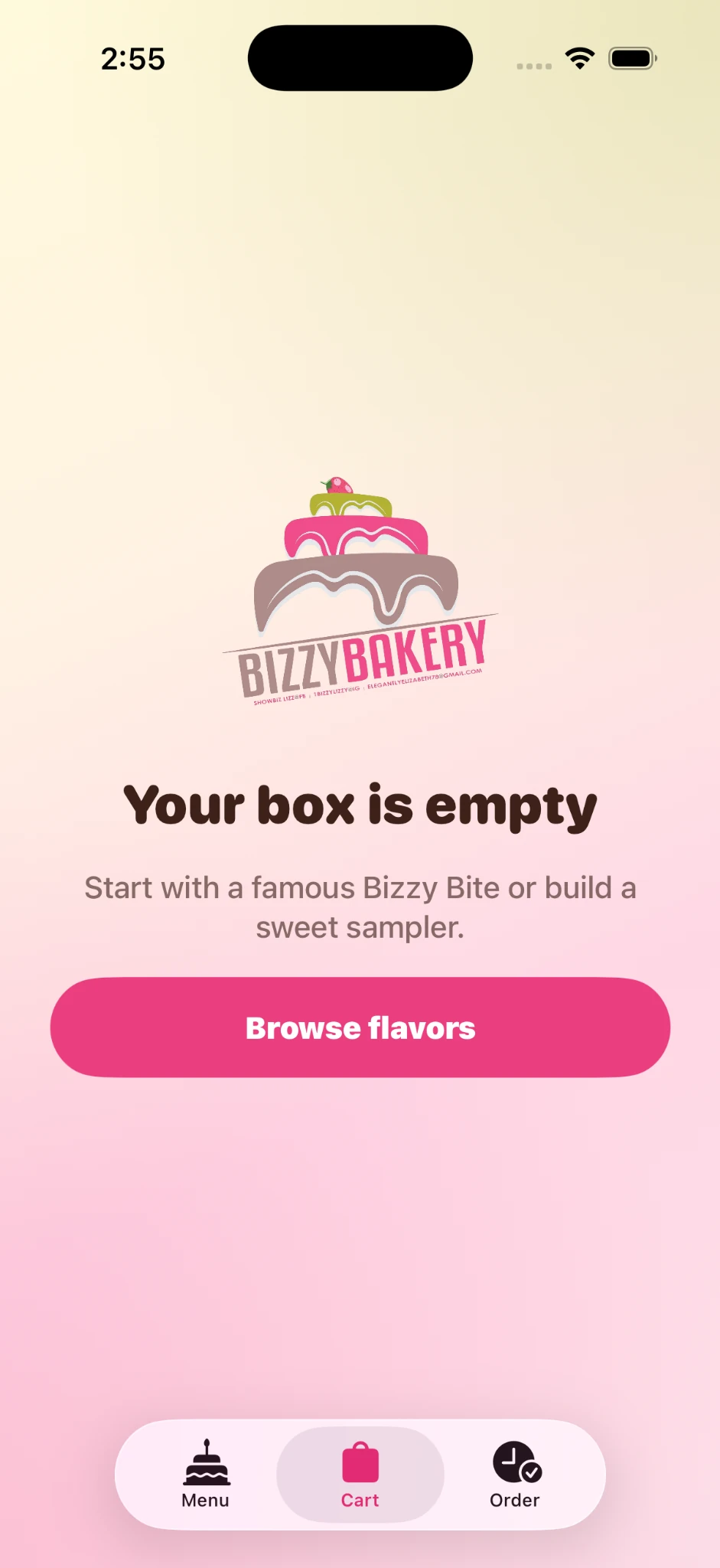
Instead of treating an empty cart like an error, the screen reinforces the product promise and gives one obvious recovery action: browse flavors.
The branded illustration and direct CTA keep the state useful without adding complexity.
04 · Fulfillment
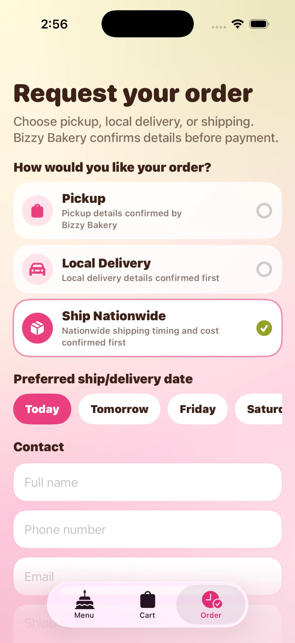
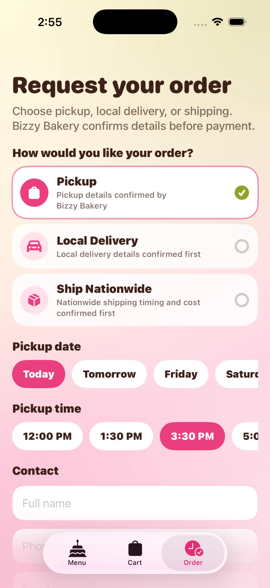
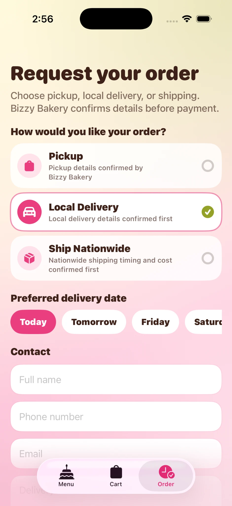
Pickup, local delivery, and nationwide shipping share the same entry point but reveal different information as the customer selects a method.
Key design decision
The most important UX decision was keeping the final step as a request rather than a guaranteed transaction.
That protects both sides. Customers understand that fulfillment details are confirmed first, while the bakery keeps control over timing, availability, delivery logistics, and shipping cost.
This made the MVP useful immediately without requiring a full inventory, logistics, payment, and shipping automation stack on day one.
Visual system
The visual language uses the bakery's existing personality as the emotional layer, then adds a cleaner interaction system underneath it.
Hot pink carries primary actions while cream and blush keep the product warm and food-forward.
Bold rounded display type gives the app personality, while simpler supporting copy keeps long forms readable.
Three core destinations keep the information architecture understandable without a deep menu structure.
AI-assisted build process
Bizzy Bakery was heavily AI-assisted throughout the process. I used AI to accelerate research, product thinking, interface exploration, implementation, debugging, and QA while keeping product decisions and experience quality under my direction.
Used for ideation, business-model thinking, MVP scoping, fulfillment strategy, UX flows, microcopy, edge cases, and design critique.
Used to shape the product experience, visual language, ordering flow, component patterns, and interaction hierarchy.
Used heavily to translate product requirements into implementation, iterate on native iOS features, debug behavior, and refine the experience.
Used to work directly with the codebase, review changes, manage implementation details, and validate fixes across iterations.
Used to test navigation, fulfillment states, visual fidelity, interaction behavior, and the actual end-to-end ordering experience.
MVP outcome
The concept creates a clear customer journey without pretending the bakery operates like a large ecommerce company.